Our Thoughts
Drawn Agency
Why Design Matters
Whether you're working with plenty of time and an unlimited budget or quite the opposite, there's a lot more to effective design than vectors.
A few months ago, I spotted an article on LinkedIn announcing the “official” end of Graphic Design as a career. The increasing presence of stock vector sites is making it easy for companies to access fantastic graphics for dirt cheap. This was exactly how the author put it. The post had almost 1,500 likes.
I'm not sure which was more surprising to me: the writer's viewpoint or the number of people who agreed with it. As I read through the comments, it became clear that there is a perception that graphic design is the sum total of great graphics. The truth is, though, that if the design process were an iceberg, the final graphic application would only be the tip of it.
I strive for two things in design: simplicity and clarity. Great design is born of those two things.
When a creative agency begins working with a new client, the first projects usually fall into several categories: urgent, non-urgent, big-budget, tighter-budget. Regardless of these categories, at Drawn, we begin by researching our client, their target market, and trends. Thereafter, we explore design approaches that will best meet the brief’s specifications. Going beyond this, we love to look for solutions that are bigger than the brief. We could call this phase one of our process.
Only once we know where we are going conceptually will we move on to the next phase, the drawing board — where we start with pencil and paper. The budget and urgency of the brief determine how much time we can spend on each phase, though we count ourselves fortunate if we get a timeline and budget that allow for camping out in phase two.
It is very easy to spot a design where both phase one and phase two were prioritized. These are the designs that usually look simple — until their cleverness hits you in the pit of your stomach. And they stay with you.
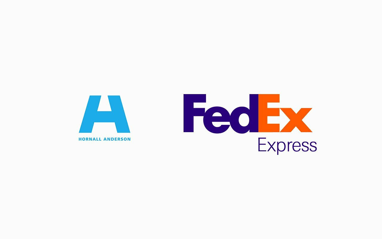
One of my all-time favorite logos is the Hornall Anderson logo. Seeing it the first time, the clean icon just seemed beautiful and interesting, until I realized that it was both an H and an A.
And then there is the FedEx logo, a widely acknowledged masterpiece. Hidden within simple typography, an arrow adds meaning because it communicates movement from left to right, a sense of moving forward. The designer who created it, Lindon Leader, famously said, “I strive for two things in design: simplicity and clarity. Great design is born of those two things.”
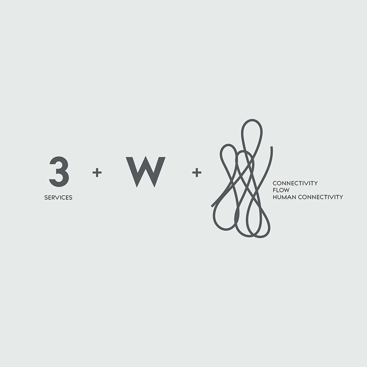
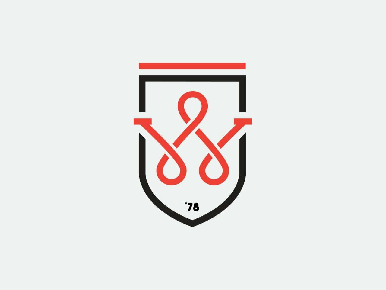
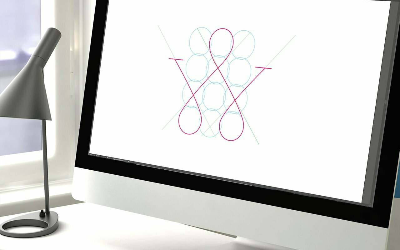
Earlier this year, Drawn had the opportunity to design an identity for Wolcott, a second-generation company based in Portland, Oregon. An established plumbing company, Wolcott branched out and began offering electric and HVAC services, and they needed a logo that would encompass all three trades.
This was an urgent project with a very short timeline, meaning that both phases one and two had to be completed efficiently and with excellence.
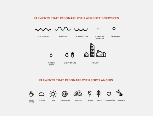
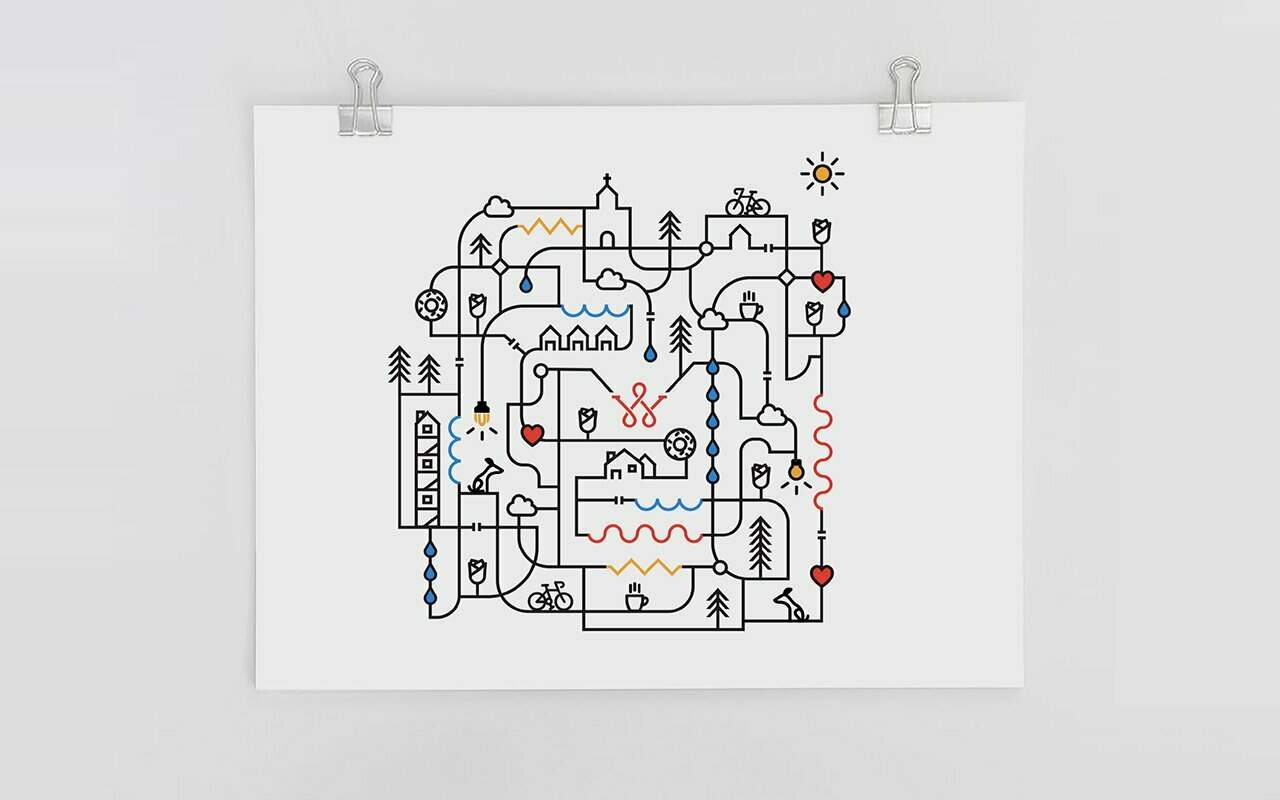
As Wolcott is a people-centric company, we wanted the brandmark to show connection and flow, in addition to acknowledging the three services they offer. Once we created the logo, we pushed it further and created a pattern that celebrates Portland and everything that’s dear to the community while, at the same time, communicating that Wolcott is not the typical plumbing, electrical, or HVAC company.
The logo was received with great enthusiasm by the client, and our work has extended far beyond that original brief.
All of the above designs are products of strategic journeys that successfully summarize the essence of the brands they represent. That is the core purpose of great design — to communicate and inform. And that essence can never be captured using a simple vector library.
- Dala Botha, Drawn Alum