Highland
The agency that always starts with “Hi”
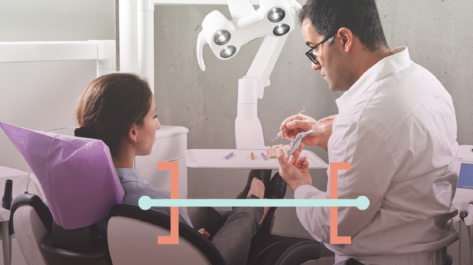
Highland Solutions was originally founded more than two decades ago as a human-centered technology company, but evolved over those decades into a digital experience design agency focused on working with mission-driven organizations. That evolution and new focus led them to seek an outside set of eyes to evaluate how their brand and messaging was aligned with their new focus, and what needed to be changed. Ultimately, we created a new brand identity and messaging platform to better communicate the brand personality that we helped Highland articulate.

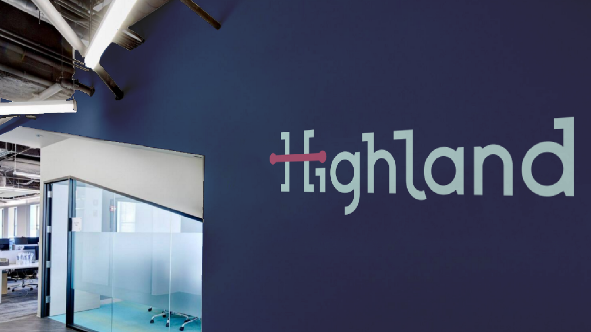
A Company That Always Says “Hi”
Highland is committed to being the kind of company that always says “Hi.” The digital experience design agency always has — and always will be — human-centered, which means that they think of their clients as people, and their clients’ customers as people, and then design accordingly. We crafted a ‘Hi’con word mark, which reflects this small but important aspect of the agency.


A Typeface That Marries Human and Digital
Highland’s former logo was cast in a slab serif font that was safe and fine, but far from warm and welcoming. We explored a variety of solutions for the updated identity before deciding to pen our own, inspired by monospaced fonts from the early tech era, but flowing and circular to feel more inviting and friendly.


"Drawn was a joy to work with, and I’m thrilled with the brand they created. Each step of the way, I felt heard, understood, and aware of where we were in the process and where we were going to end up."